+9
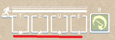
Shouldn't these be removed?
When the game was at it's beginning (and a while after that) each slot was purposed to store exactly one kind of item. Now the first 2 slots are for potions and the other ones are for items.
So shouldnt the little icons underneath the slots be removed?

Customer support service by UserEcho


It makes sense since a lot of items were added and there are not just hp and speed pots or throwing knives and bombs.This should be removed,it's unnecesary to keep this,so +1.
yeah i agree
Or change these to potion icons and item icons.
I foresee no reason not to remove them.
why does anyone care
Lol I actually never noticed that xD. I mean I guess it should be removed, but it's not that big of a deal......
No actually that's rezoner telling you the ideal items 4 your inventory.
This is not that big of a deal if it doesn't remove so why you make a racket about this.
maybe those are the 4 elements of the wilds world :)
health, energy, explosion, and knife. Long time ago, the four nations lived in peace and harmony.... until the knife nation attacked
....
lool
Umm,that's just ridiculous.That doesn't make sense obviously.Just no,no..no.....no
i think rezoners could make the menu and item slots more polished
Wow.21/10 perfect.