+17
Under review
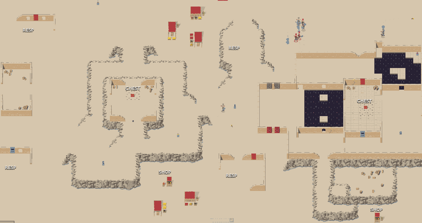
New Map Screenshot
Until Janusz makes something better this will be the first map utilizing mountains.

Customer support service by UserEcho


And what about the stores to exchange knives and pots? You decided to delete them or until you add them?
They are above and below top and bottom markets.
Is anyone using these anyway? I thought everyone is crazy about selling stuff now :)
I can confirm people still use all shops in game :P
Looks a little cluttered, but nice!
Also, I see some spears in the pits! Very good.. The map will be so much bigger!
Overall: 6/10! Still too many ways a runner could escape.
wooow epic
Nice !
are those walls rocks?
the lack of diagonal lines makes it seems a little too much pokemon, and old rpg in general.
But it looks fun, so I have no complaint!
I'd add, the lack of variety in the diagonal lines more than anything else.
As long as it isn't too cramped.
though honestly I would like something bigger and more spaced out.
Good job!
Add some trees :)
In principle a good idea, but I think you should add a safe zone for each team, or just one area, but the damage it will be impossible to obtain. Still need to add more boxes, but overall I like it.When will be the test card, I think will be easier to see what should be added.
I see a problem with the respawn points. The top right corner and bottom right corner will not be used. The chest on the right side will attract some visitors, however there really is no point in traveling anywhere above or below that。 (Closer shops to respawn points near the middle.) Overall very nice design, especially with the mountainous regions.
Batful
This is the screen of the previous map :p