+11
Under review
New pits!
Hi, some time ago in one of my posts I showed an example of how that might look like pits.
I was thinking of diversify their bit and add something that drew attention to the fact no one wants to fall into such a pit.
Post referred you can check here:
http://wilds.userecho.com/topics/1736-remove-sand-worms-from-pits-small-map-fixes/
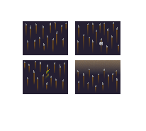
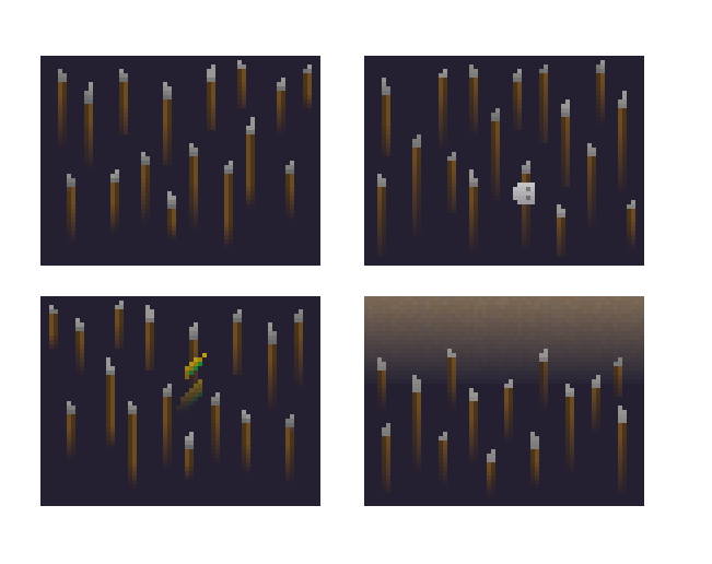
I decided to do something in this direction, and in my free time I designed a new look for the pits.
I think they look better than the current black holes, but I'm waiting for your opinion on whether you like it or not.
This is original graphics: (all parts are perfectly matched, you only need to replace them)

Zoomed:

As always, I look forward to your opinions. I think we can still do a lot for this game;]
Regards, Egzekutor
Customer support service by UserEcho


Fantastic graphics and idea. This will take the void feeling to the next level!
Thanks for support ;3
loooool, beatifuuul *-*
I'am glad you like this ;3
use gimp? what program? :3
Gimp 2 and sometimes paint :P
:o is precious
Very nice
nice
The graphics are awesome,just some spikes rising from the abys,the temple will be more like a temple and not floaty rocks on black shit
This is what I ment. To spice pits and give them some color.
Good :V
It's quite too dense in real life
I have made a little less crowded approach.
Yea It looks a little better. I do not pay attention that the distance will be so close to each other. But your looks great.
finally can comment
...XD
uroooos xD
XD