
Remove sand worms from pits / Small map fixes
1. As in the topic:
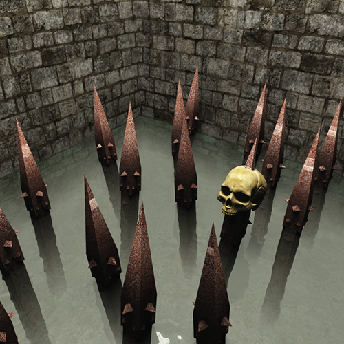
Sand worms sometimes have a tendency to eat before it falls into the hole. This is annoying because sometimes when you just want to jump on the platform, suddenly be eaten by one of them.
2. bad placement the shops:
Picture one:
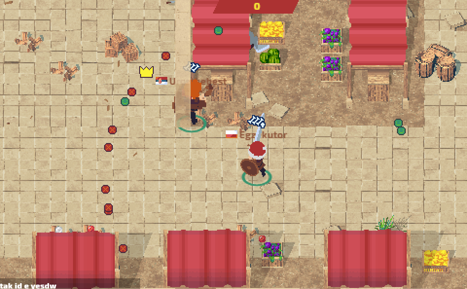
(Ty Urosthebest for help)
Picture two:
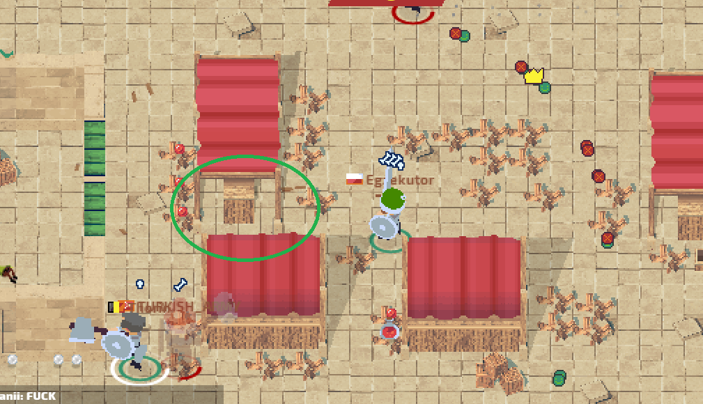
(Pro tip: You can jump through the center of the every one store)
3. Difficult to see the columns:
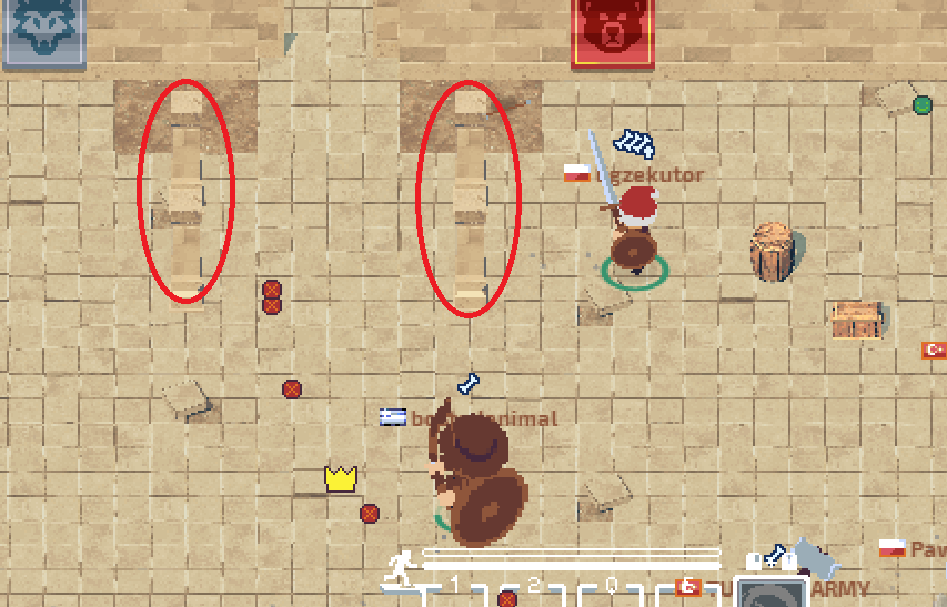
Columns should have a darker color, because it blend in with the surroundings, or should be separated from one another.
What is interesting is not the first time it is hard to spot this columns on a light background floor.
4. Difficult to see the transition:
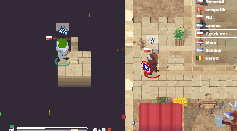
5. No collision with the library:
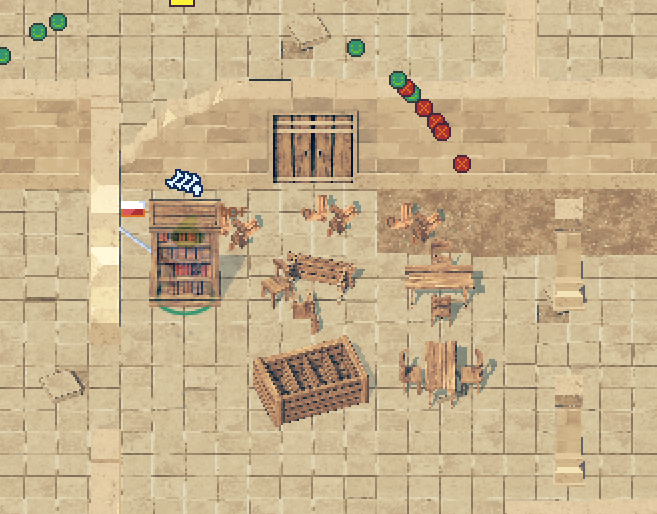
It's small bug. but i think the library need colision like other furniture.
6. Bad location of the garden:
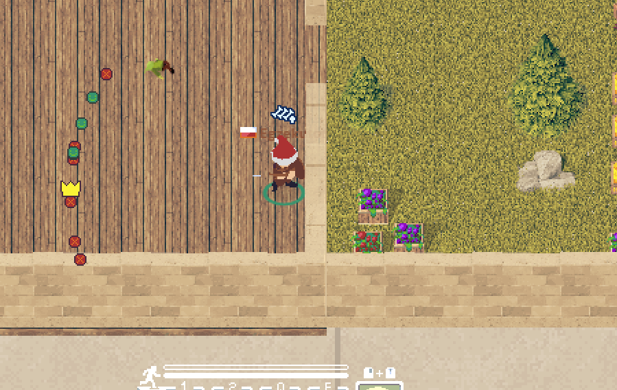
(Btw. this garden is awesome, and in my mind i see cool forest map ;p)
The summary:
A new map is great but it still needs to be improved, and I hope that thanks to my efforts, other players, and of course your Rez, manage to make that this game will be even better.
Regards,
Egzekutor
Customer support service by UserEcho


Good job egzekutor, it shows that you strive! :D
By the way it seems strange but I must be blind because ... where is that garden ?? !!
Thanks Bro.
You have to go right of the red spawn.
I wander if he did that with the garden in order to taunt us. lol
I'm not a fan of furniture, I wish that it could be broken.
I think this is just mistake with map creation.
Sure, sometimes the chairs and tables can block you. I would like to be able to jump over them.
The columns and open transitions for the treasure room are quite difficult to see, maybe make the floor darker for areas that have a transition? And maybe remove the columns that aren't needed in certain areas?
Also I thought about doing a darker floor. On the opposite side you can see perfectly passage.
Why can not you enter the garden? It's a mistake?
Garden was located on the border of the map and so you can not go in there. It just needs to be repaired.
aah okay :D thanks
I so not like new worm pit yeah this idea is so good (and this epic spikes in pit idea is EPIC EPIC AWESOME MEGA PUPER SUPER ULTRA AWESOME!
I have all of these in mind - I will only comment on sandworms for now:
> Sand worms sometimes have a tendency to eat before it falls into the hole.
There are no sandworms in the pit - the mechanics is exactly like it was - the only difference is that instead of playing fall down animation - I play sandworm attack there - but there is no real sandworm, it's just a sprite :)